Sun, Moon and Owl – The Many Faces of Celestino Piatti
The graphic artist, painter, poster and book designer Celestino Piatti (1922-2007) repeatedly featured timeless motifs such as suns and owls in his work. The Zentralbibliothek Zürich holds items such items in its collection as posters for the referendum on the library extension. However, some lesser-known aspects of his work are still waiting to be discovered.
A first competition entry

In a Swiss school calendar, you’ll find one of the Zurich-born artist’s earliest creative expressions: in 1938, when he was just sixteen years old, Piatti offered us a first sample of his artistic skill when he took part in a drawing competition associated with the Pestalozzi calendar and won a prize.
His picture shows a group of mourners by the beloved calendar’s graveside. The linocut skilfully makes use of what this medium has to offer: the adults’ faces are furrowed with worry and grief, while the children wipe tears from their eyes with angular movements of their arms. In the background, the gnarled branches of a bare tree reach into the sky, but offer no succour.
From calendar to calendar

Many years later, Piatti would, once again, contribute his art to a Swiss school calendar, this time as a renowned graphic artist: from 1964 to 1974, readers of the cover of the ‘My Friend’ youth calendar were treated to a Piatti sun.
The profile of the moon is set into the face of the sun. This creates a ‘Janus-like’ impression, as Andreas Platthaus described it in the anniversary publication. In this way, Piatti gives these heavenly bodies a pensive aspect, indirectly recalling his picture books, which combine humour and deeper meaning in equal measure.
The sun and moon are key motifs in Piatti’s work, alongside perhaps his best-known subject: the owl. He didn’t just commit this to paper – he even cast it in metal.
A red owl in the Graphic Collection

That’s how an iron owl made its way into the Zentralbibliothek Zürich’s Graphic Collection. Painted bright red, and a little larger than life, this majestic bird is full of grace and grandeur. It entered the collection following the exhibition curated by Bruno Weber, ‘Celestino Piatti. Thirty years of book design’, which was held in the ZB’s Predigerchor chancel in 1986/87 and was accompanied by the publication ‘Meister des graphischen Sinnbilds’ [‘Master of the graphic symbol’].
As captured by German photographer Thilo Beu, the bird also invites you to experience the world through an owl’s eyes, as the artist himself demonstrated. In a reversal of his many images of owls, here he turns a friendly yet penetrating gaze from their perspective on us.

Votes for owl

After 1986, Celestino Piatti created three posters for the Zentralbibliothek. One for the referendum on the ZB Zürich extension, in different versions for the cantonal and city referenda, respectively. ‘Die ZB ist für alle da’ (‘The ZB is there for everyone’) was the striking slogan used at the time by the Yes campaign for the building extension. It was ultimately approved.
The artist also created the exhibition poster for the ‘Celestino Piatti – thirty years of book design’ exhibition in the Zentralbibliothek. It fuses an owl’s head with a book. A third poster depicts the bird of wisdom in many colours. The slogan that runs around the poster, ‘Zürich has many good sides – most of them in the Zentralbibliothek’, was coined by Rainer Diederich, a former head of PR at ZB Zürich.
Write here, not in the book

Piatti made another mark on the ZB in 2001 – with a bookmark, issued by the Friends of the Zentralbibliothek. It provided space for people to make notes with a pencil, also designed by Piatti. ‘Write here, not in the book,’ the ZB urged its readers. This was an appealing way to remind them that the library is a space for all and care is a virtue when handling books.
In this way, Piatti left subtle but powerful traces in the ZB and Zurich as a whole. Celestino Piatti was born in January 1922. He died in December 2007. Here, the arc of time comes to an end, just like a book illustrated by this magnificent artist.
From The Happy Owls to the Holy Night – Celestino Piatti’s picture books
Owls at peace
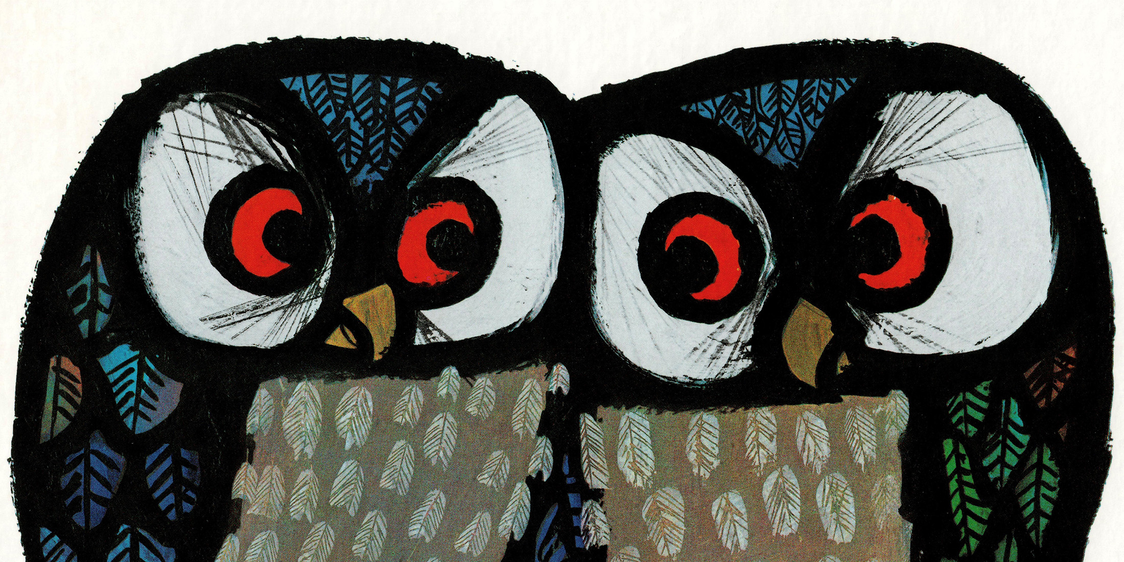
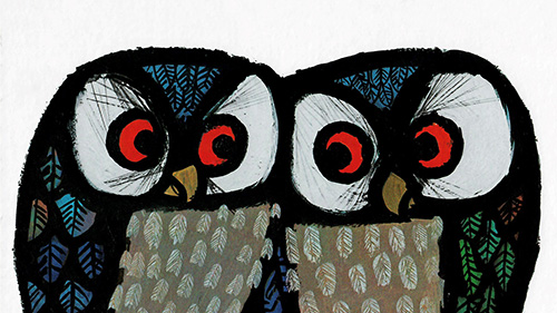
With his very first picture book in 1963, Celestino Piatti created a perennial bestseller that can still be found on children’s bookshelves today: ‘The Happy Owls’. The story of the contented birds really makes an impression thanks to its restrained approach to illustration, focusing on the individual birds against a white background.
Children’s book publisher and collector Bettina Hürlimann described Piatti’s book in the 1960s as a ‘milestone in the modern art of picture books’. She saw his aesthetic as ‘the close-up, inspired by photography [...] wonderfully transformed by the clever possibilities of modern graphic art’.

Animal ABC
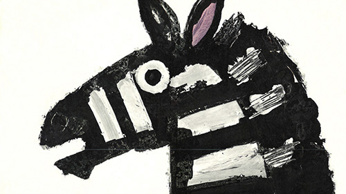
Piatti’s book of ABCs was also met with widespread and lasting acclaim. Cleverly targeting the English market, it lists the alphabet using animal names, from A for Alligator to Z for Zebra.
Even the illustrations of animals who don’t actually appear are brilliant. The figure representing the letter J can only be made out from the traces he leaves behind: ‘a jaguar passed by here / a quarter of an hour ago’. Piatti’s huge skill in handling the landscape format is evident from the giraffe, whose long neck spans a double page. The images were also available as individual sheets, ideal for hanging in children’s bedrooms or classrooms.

At the Circus
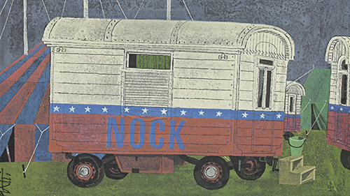
The ABC was followed by a depiction of the wonderful world of the circus. With the arrival of the travelling Circus Nock, viewers discover the everyday life of the circus, told in realistic images. Celestino Piatti emphasises his depiction with a toned down, almost delicate sense of colour – none of his trademark sharp edges can be seen here.
There’s no trace of the romance of the circus, once the tent has been taken down, lunch has been cooked, and the acrobat children are doing their homework. One of the kids even balances a pen on the tip of their nose. But during the performance, the scene bursts into life: artists and animals whirl through the arena and perspectives intersect to create a thrilling spectacle. The circus has arrived!

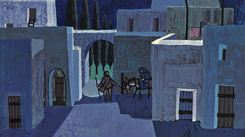
Silent Night
The artist begins a new chapter in terms of subject matter by illustrating the Christmas story. Stylistically, a more painterly design is apparent. At the same time, the figures, especially their faces, edged with bold dark lines like lead strips from which the eyes shine white, are highly reminiscent of the technique used in church windows. Hans ten Doornkaat described this as a ‘church or stained-glass window style’. The deep blue of night and the radiance of the heavenly bodies help create the atmosphere of the Holy Night.

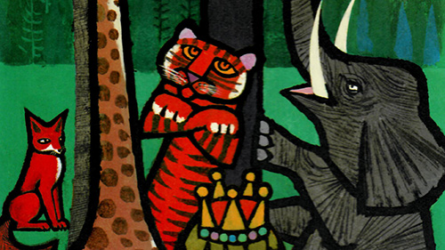
An apple of discord
Like ‘The Happy Owls’, ‘The Golden Apple’ is another parable about humanity’s selfishness and desire for conflict. Hanging from a tree, this appealing fruit becomes an apple of discord for the animals, who fight over it with all their might. In the story’s conciliatory conclusion, a child in need discovers the golden apple.
The portrait format conveys how far the apple lies out of reach, just like the length of the giraffe’s neck. Unlike in the ABC, she can hold it gracefully aloft. Celestino Piatti reflects the verbal rhythm of the text by Max Bolliger in an equally rhythmic sequence of images.

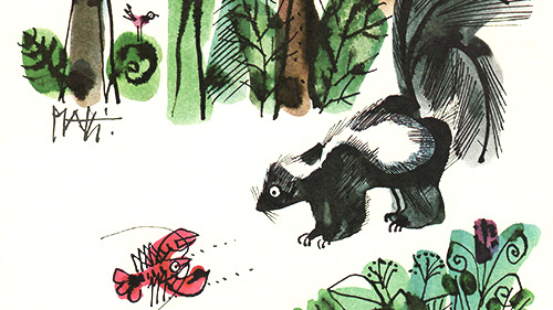
Scuttling back and forth
When a cheeky crab breaks out of his ordinary existence and goes out into the world, he can’t do it alone. Frustrated by always having to go backwards, a little crab comes out of his shell so he can experience new ways of being. He soon encounters other animals like raccoons, skunks and toads, who also want to escape from defined patterns of behaviour. However, they soon see the disadvantages of the unfamiliar and return to their trusted surroundings – armed with new experience.
Piatti presents all of this in delicate watercolours, allowing them to blend and merge. Instead of sharp edges, he chooses quick pen strokes that emphasise the comedy of the figures. As in ‘Circus Nock’ and, subsequently, in ‘Barbara and the Dormouse’, the text is by the illustrator’s wife, Ursula Piatti.

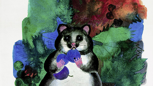
Technicolour furry animals
Piatti’s final picture book presents Barbara, the artist’s daughter, at the heart of the action. The story of the little girl’s encounter with a dormouse is based on an actual experience in the Piatti family’s attic, as Ursula Piatti wrote in the afterword to the 2021 picture book collection.
Expressed in fine watercolours once again, the design vocabulary has a childlike feel, with round, even bulbous shapes and splotches of colour in the background. In this way, the illustrator carefully yet colourfully depicts the relationship between child and animal.

Celestino Piatti – Information
At the Zentralbibliothek Zürich, alongside Piatti’s illustrated books, you’ll also find exhibition catalogues, an anniversary publication and an anthology. Here is a selection:
- ‘Celestino Piatti – Alles was ich male, hat Augen’ [‘Celestino Piatti – Everything I paint has eyes’], edited by Claudio Miozzari and Barbara Piatti – the Celestino Piatti 100th anniversary book
- ‘Piatti für Kinder’ [‘Piatti for Children’], with text by Max Bolliger, Ursula Piatti and others – the seven picture books illustrated by Celestino Piatti in one collection
- ‘Celestino Piatti. Meister des graphischen Sinnbilds’ [‘Master of the Graphic Symbol’], edited by Bruno Weber
The SRF TV show Karussell dedicated an item to Celestino Piatti in January 1987. It features a selection of highlights from his works and an interview with the artist himself.
TV report on Celestino Piatti’s 65th birthday (video: SRF)
Dr. Anna Lehninger, art historian, Graphic Collection and Photo Archive project team member
October 2022
Header image: The two famous owls on the cover of the picture book ‘The Happy Owls’ (© NordSüd Verlag)
Citations
The author created this post based on works referred to in the last section and Bettina Hürlimann’s ‘Die Welt im Bilderbuch. Moderne Kinderbilderbücher aus 24 Ländern’ [‘The World in a Picture Book. Modern Children’s Picture Books from 24 Countries’]. The direct quotations from this book can be found on pages 16 and 67. In ‘Celestino Piatti. Meister des graphischen Sinnbilds’, Hans te Doornkaat describes Piatti’s ‘church or stained-glass window’ style. In ‘Celestino Piatti – Alles was ich male, hat Augen’, the author largely draws on Andreas Platthaus’ contribution, ‘Celestino Piattis Augenblicke’ [‘Celestino Piatti’s Moments’]. He mentions the ‘Janus-like’ nature of the sun on the ‘My Friend’ calendar on page 21.